Warm minimalist condo design depends on more than an uncluttered photograph. It asks how colour, furniture and surfaces can work together without making a home feel impersonal. Zen Calm Living, Vicissitudes Studio’s residential project at TRX Residence, offers a clear example. Listed in the studio’s portfolio as a 2025 project, it is described through soft neutrals, clean lines and calming natural textures.
This case study reads the completed interior through its published project photographs. It focuses on visible design decisions rather than assuming a client’s brief, an original floor plan or a renovation budget. For homeowners considering a Kuala Lumpur condominium interior, the useful question is how those decisions might inform a considered conversation about their own space.
Design Challenge
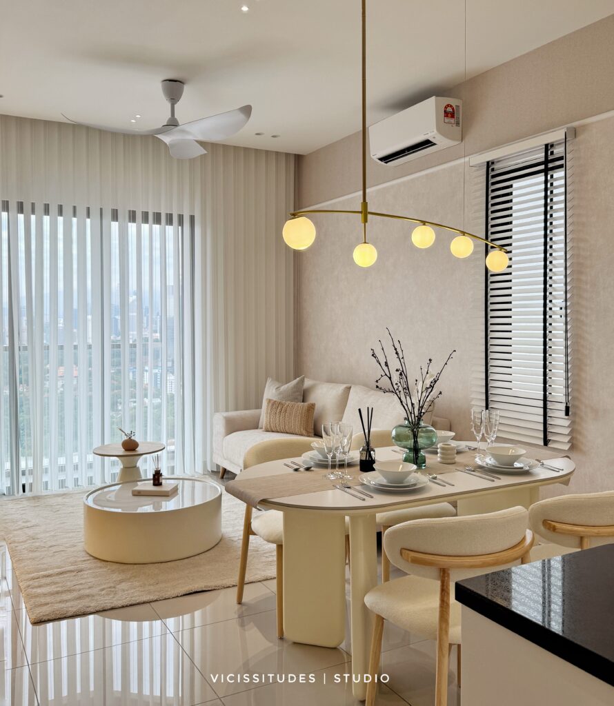
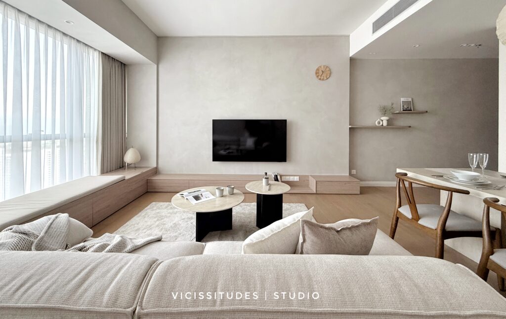
The design question illustrated here is straightforward: how can a restrained living and dining area retain warmth and visual interest? This is an educational reading of the finished room, not a claim about an undocumented problem before renovation. The published photographs show a pale sofa, a light rug, a dining table, low cabinetry and a broad window opening within one connected composition.
With so few dominant colours, proportion becomes especially noticeable. A television, a coffee table or a dark furniture base can carry considerable visual weight against pale surfaces. The room therefore provides a useful way to examine relationships: between the sofa and the rug, the low cabinet and the wall, and the dining furniture and the adjoining seating area.
For a different home, the starting point should still be its actual use. Consider where people sit, how they move between dining and living, what needs storage and which views should remain open. These are planning questions, not evidence that Zen Calm Living had particular circulation difficulties. The photographs do not establish dimensions or structural changes, so they should not be used as a substitute for measured drawings.
Design Approach
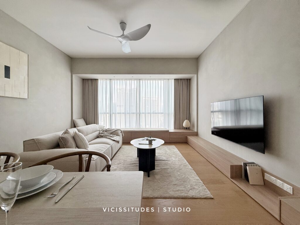
One visible organising device is the low horizontal line. Cabinetry runs beneath the television, while a low ledge sits along the window. Together with the sofa, these elements keep much of the room’s visual emphasis below eye level. The wall above the cabinet remains relatively quiet, allowing the window and a small arrangement of shelves to become distinct features.
The palette gains interest through differences in surface and form. Upholstery and the rug soften the composition; timber-toned cabinetry and flooring introduce a warmer register. Rounded coffee-table tops contrast with the straighter cabinet edges. Dark table bases and the television add definition without turning every object into a focal point. These descriptions concern what is visible, not a specification of wood species, stone type or finish brand.
Window treatment also contributes to the reading of the space. Sheer curtains sit within the broad opening, with heavier curtains at its sides. The photographs show daylight filtering into the living area. The U.S. Department of Energy’s introduction to daylighting explains the general relationship between windows, interior design and natural light. Its climate-specific guidance should not be copied directly to a Malaysian condo; orientation, glare, privacy and heat still require assessment on site.
For homeowners, the transferable lesson is to review materials together. Compare the sofa fabric, cabinetry tone, rug and wall finish as one palette rather than selecting each in isolation. Test samples under the home’s own lighting and discuss cleaning requirements. This is general design advice informed by the composition, not a claim about the project’s procurement or maintenance performance.
Design Outcome
The documented outcome is a finished interior whose parts share a restrained visual language. The wide living-room photograph shows the dining area in the foreground, a pale sofa to one side and low cabinetry facing it. A second view draws attention to the floating shelves and the continuity of the cabinet line. Together, the images explain the studio’s published description of a serene retreat more specifically than a style label alone.
Warm minimalist condo design here is readable as a set of relationships: light and dark, straight and rounded, smooth and textured. The room is composed rather than empty. A small number of contrasting elements gives the eye somewhere to settle while the neutral background keeps those contrasts connected. The lesson is not to reproduce every object, but to understand the role each one plays.
The evidence stops at the published portfolio and photographs. There are no verified figures for improved storage, energy use, resale value or rental returns, and no client testimonial is needed to make this case study useful. A prospective homeowner can instead use the project to discuss preferred atmosphere, furniture scale and material direction, then develop a solution around a different property’s measurements and daily routines.
Conclusion
Zen Calm Living demonstrates how a modest colour range can support a layered interior when proportion and texture receive attention. Its soft furnishings, low horizontal forms and carefully limited contrast offer a practical reference for homeowners exploring a quieter residential palette.
View the full project gallery for context, then review Vicissitudes Studio’s residential services and design workflow when planning your own home. The next step is a discussion grounded in your space and priorities, not a promise that one photographed solution will work everywhere.
View the Zen Calm Living project gallery
Explore Vicissitudes Studio’s residential interior design services
Review the studio’s design workflow
Daylighting: an introduction from the U.S. Department of Energy